Borging My Layouts (And a Skateboarder Class)
Borg Layouts
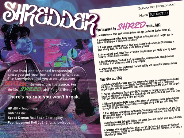
I've been playing a lot of CY_BORG lately, and wrote up a little class for it based on a character from Snowcrash that I like (she's a skateboarding courier). I figured I'd try to match the maximalist layout style of Borg games in presenting my class.
If you haven't played a borg game, they are known for very busy, artistic page designs, sometimes at the expense of readability (though I think the best borg games manage readability and exciting layouts). Lots of color, lots of different fonts.
I like this for a Cyberpunk game. Using lots of fonts and colors provides a way to give a game a punk aesthetic that's difficult to achieve in a more "textbook" style gamebook.
One of the first things I noticed doing layouts in this style is that it forced me to be a bit more thoughtful. What do I want my fonts to say? Why am I making each color choice? Does tilting the text here make a cool effect or is it just annoying? Even when I do more traditional layouts, I think I will give them more thought now.
So here's my first pass at it.
I think I have some legibility issues to clean up in a couple places, but I think it hits the vibe I'm going for.
Reboot classes
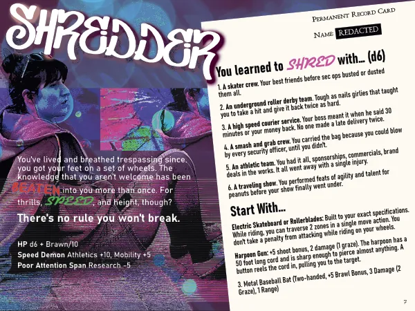
As long as I'm working on a class for a different Cyberpunk game, I might as well imagine what it might look like in Reboot, the Cyberpunk game I'm working on (it's a d100 roll under system).
Reboot won't really have traditional classes since there's no leveling up, but I do want to include some backgrounds that mix up each characters starting inventories and give each player some unique options right off the bat. Here's what that might look like.
Opening Pages
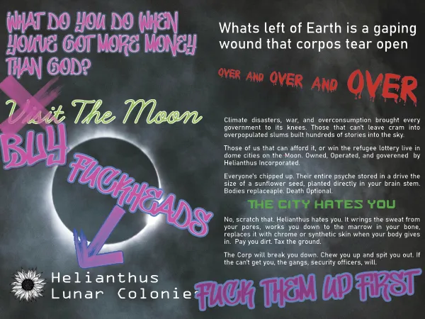
I also made a quick layout for the first couple pages of the rulebook, which will help me show people the tone I'm going for. I decided to use a lot of graffiti fonts here and place them so that it looks like defacement of corporate advertising. I like my corporations irredeemable in my Cyberpunk, so I want to impress that on the player as well as hint at some of the key technology in the setting, namely, bodies being swappable, and death largely avoidable.
Once again, I think there's some legibility to work out, but I think it's almost there.
Art and Assets
I'm not great with a pen and paper, so I turned to free use resources. You can find tons of great photos on Unsplash. This is where I found the photo of the girl and the photo of the moon.
I left the moon fairly unedited, but the girl I edited quite a bit. To start with I added a blue bubble pattern with a light pink mask, and then just blended it all together (by the way, blend modes are like cheating, they just make your shit look cool?).
Lastly, I did some data bending. I explained this in another post, but basically, I opened the image in an audio editing software, added phaser effects to the beginning and end, and echo to the middle, then exported as raw data and converted to an image. This creates the glitchy looking effect at the top and bottom, and the repetition of the girl's face. I think I'm getting the hang of doing editing like this with a little more intentionality! Rather than just adding effects and seeing what happens, I actually had some goals in mind and knew what audio effects to achieve them with.
I did the layouts in Affinity, which is apparently now free, so worth a look if you need a publishing software.
All the fonts came from Dafont, who kindly have a filter for 100% free to use fonts. It's really easy to go down a font rabbit hole. I spent a long time browsing fonts.
Anyway, I really enjoyed doing my layouts in this manner. Even though I'm not making a borg game, I think maximalist layouts can still have a place, especially in rules light games where you can often afford to lose a little information density without losing clarity, as long as you don't go too crazy.